Branding
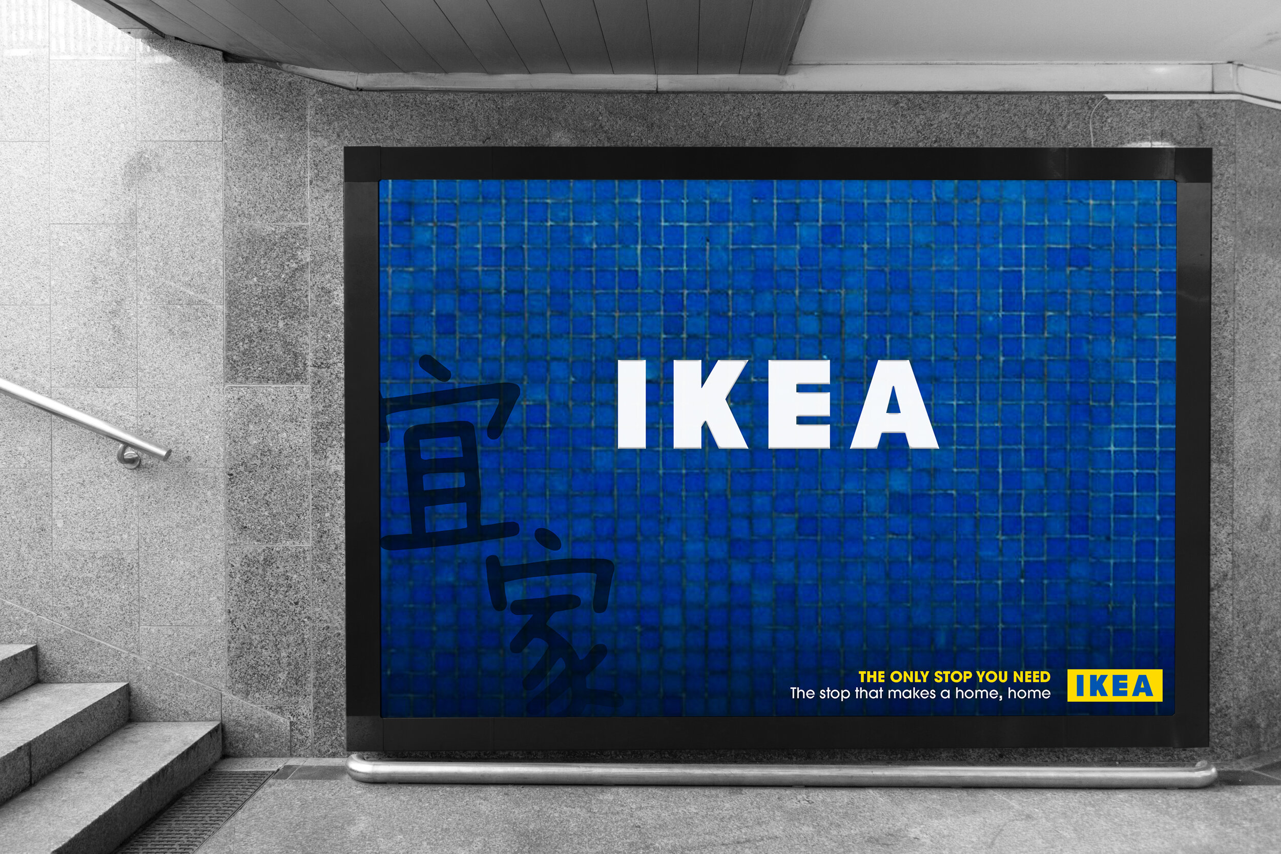
Ad Campaign
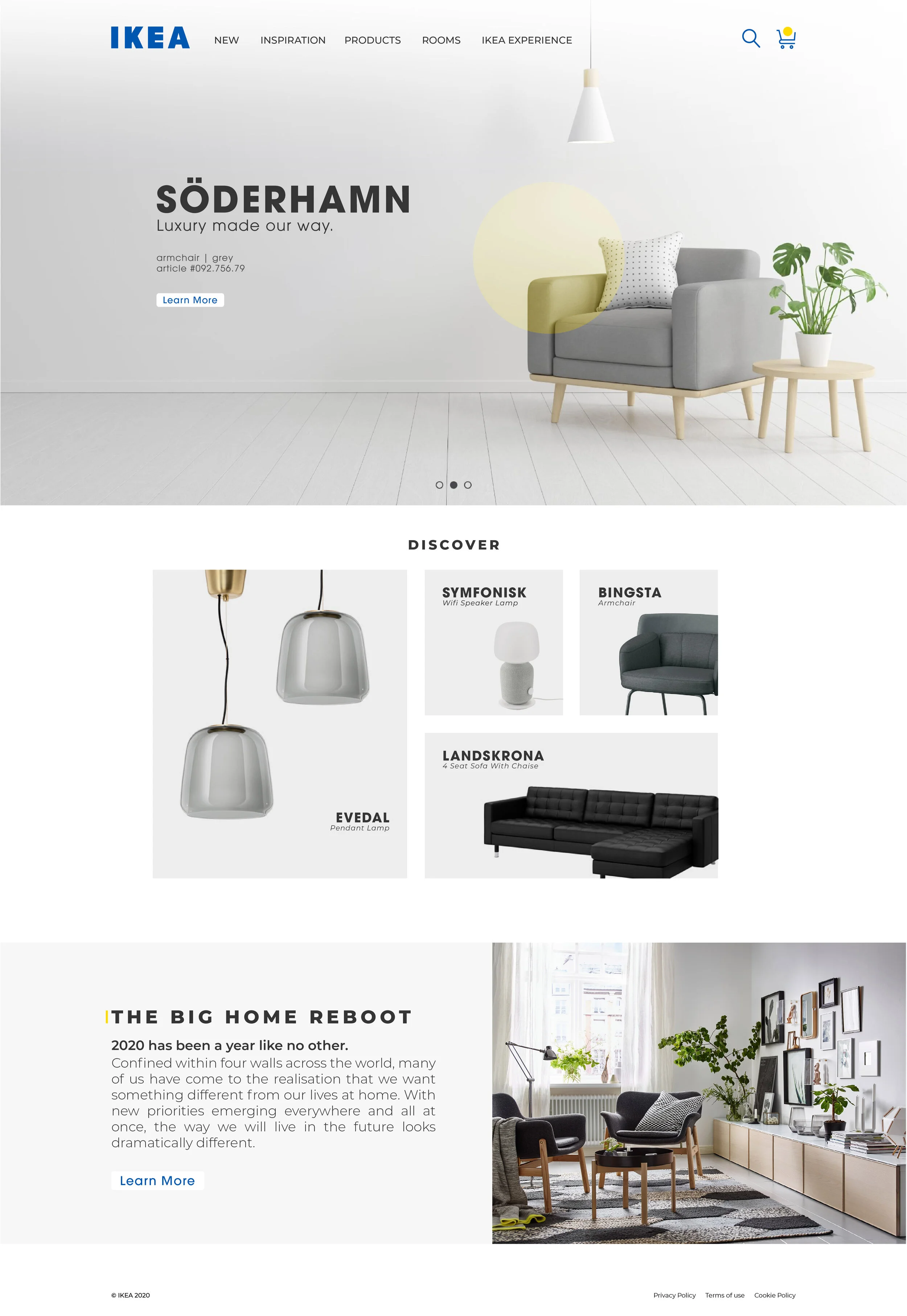
Web Design
Packaging
Overview
To rebrand and create an intergrated system for the infamous home goods company, IKEA.
*university project
Concept
IKEA strives to provide simple, minimal and modern design solutions to your home, thus, the branding should represent just that. A clean and bold look. The new identity draws inspiration from it’s original branding to remain familiar while refreshing. The iconic colors and bold lettering remain constant as it will help maintain brand loyalty and association. The branding identity remains simple, approachable and trustworthy.
Packaging for smaller good are re-designed to deliver a cleaner and modern look with the additional integration of the assembly instructions. The web design is also made to be more user friendly and to better reflect the simple and modern philosophy of the brand. In addition, an AR experience is introduced to help online shopping feel closer to the designed settings of an actual IKEA.
It also allows you to skip to exactly where you want to be!


A NEW WAY TO ASSEMBLE
Newly introduced concept include making assembly instructions easier through a guided video.
This can be accessed upon opening the packaging by scanning a QR code. It takes you through a step-by-step video at your own speed.